PILOT
PILOT is an immersive narrative made in, and for, VR. The story is a direct continuation of the 1979 film Alien and a love letter to H.R. Giger’s vision.
I’ve wanted to make a film with the Space Jockey since I was a kid. Its brief appearance in Alien was one of the most impactful moments I’ve seen on film. Now, since VR + Quill has given creators a natural way to 3D model, animate, and sequence stories am I ready to spend creative energy on bringing my childhood imagination to life.
I will be documenting my 10 year journey with this project as it grows. If I never finish Pilot then this page will be a blueprint for how to build it.
This is a personal (not professional or paid) art project. It’s in honor of the world H.R. Giger, Dan O’Bannon, Ridley Scott, and others created.
The Spark
Alien had a massive impact on me as a kid. Everything about it. The pure vision, mystery, brutality, scale, atmosphere, score, cinematography, and especially the design. It inspired me to become a creative professional and eventually make this short.
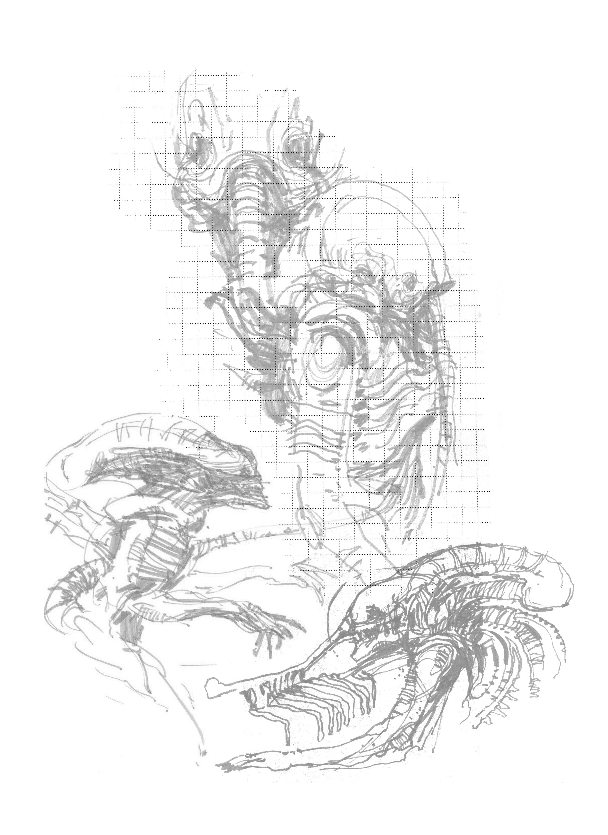
The mystery around the Space Jockey (Pilot as it was called in production) has stuck with me over the years. I always wanted to see more of that mysterious character as a terrifying creature. Emphasis is on CREATURE. I believe that was its original intent. To me its design is as iconic as the alien itself. I don’t intent to spoil it’s mystery with unnecessary background lore. I just want to give it more screen time and add cool details that bring the Space Jockey to life.
Scope & Timeline
The scope for this project is immense. Especially for one person. So I plan on chiseling away at it for years. Similar to Phil Tippett and his stop motion film Mad God. I most certainly identify with the passion behind that project. It's the same stuff that fuels this project.
To get me through the scale of this project I treat each step as a mini project. That way I can maintain motivation over the years. I also want to use Pilot as a learning vehicle. Not only will the project grow but so will my abilities as a story teller and creator. I look forward to working on new (to me) disciplines like writing, music, character animation, and actor directing.
In order to stay focused and on schedule I deploy a couple tools/workflows from my day job as a digital product designer. My main go to for prioritizing and planning is Trello. Without a task manager it would be impossible to get anything done. This project would be completely overwhelming. At the end of every year I create high level task and prioritize them based on the overall schedule. The other tool I use is a production tracker. For this I created a Google Sheet that tracks scenes, various assets and their metrics to make sure the master Quill file doesn’t max out, and the status for each scene.
Research
To find the right balance of existing lore and new elements I combed through as much reference material as possible. I wanted to see what ideas the original creators were exploring around the production of the first film. I also wanted to get to the core of what drove their design thinking. Deeply understand the motivating forces that inspired them. That way I can create new ideas that feel authentic because it comes from the same foundations. So I dug through art books, behind-the-scenes docs, Dan O’bannon’s original script, graphic design deep dives, and countless articles/thought pieces. I also looked at adjacent stories like Dark Star, The Thing, Annihilation, and especially At the Mountains of Madness. These all involve similar themes and some even inspired the Alien film itself.
Story Design
Bottom line: This story is about humanity’s drive to find answers and how that can lead to madness.
Synopsis: A crew of five and one replicant, aboard Tyrell Corporation’s emerging technology research vehicle ‘Futami 002’, are on a mission to beat Waylin Yutani to an undiscovered planet. Contact with the mission’s first vehicle ‘Futami 001’ has gone silent. While searching for the missing vehicle, the crew of ‘Futami 002’ encounter a horrific world beyond their understanding.
Mystery: Alien (1979) is described by some as a haunted house film in space. It’s claustrophobic, scary, and mysterious. The Alien and Space Jockey don’t have an explanation. They are monsters made more terrifying by being mysterious. . . Some questions are better left unanswered.
Alien & Unsettling Otherness: The direction Prometheus takes is the reason why I’m making this short in the first place. In Pilot, the Space Jockey is a terrifying creature, much like the alien itself. It’s a visual reflection of the vast uncaring universe. Its motivations are weird, mysterious, and unsettling. Its completely different from us. . . alien.
Alien planet: Other territories I want to explore further include Giger’s idea of the Alien’s home planet, and its technology, as an intermixed organism. You can’t tell where the tech ends and the creatures begin. Everything is alive and pulsating. It's a brutaly hostile environment.
Psychological Horror: Another concept is that the Space Jockey has telekinetic abilities. I love the idea of adding this element to this universe. I also want to touch on Ridley’s early ideas (pre-facehugger?) of the Alien’s short and brutal life cycle. How eventually the Alien will become frail and cocoon itself. What comes out of the cocoon is very intriguing territory to me. However, this aspect is only flavor to the main story.
Delivery: Given Pilot is only a slice of a longer narrative, and I don’t have enough time to flesh out characters just with visual animation, I will use conventional mechanics that enable efficient storytelling. For example, I’ll use monologue to anchor the story around a single character. This will tighten the focus so I can move quickly through character interaction and story beats. Also, I will focus on key scenes that drive the narrative and flavor the world. I’m going for a very moody feel that’s dipped in nuance. So, Viewers will benefit from having seen the first Alien film. I will also layer detail thru environmental storytelling. The backstory is there to be discovered rather than handed to the viewer.
Simplicity: Another major challenge with this 10 yr project is to maintain a simple theme/message as I grow as a person. Being a personal project works to my advantage. There wont to be “too many cooks in the kitchen” and it wont feel like its “designed by committee.” I have complete control so if the message or visuals end up messy then its all on me. Another aspect here is I want this to be a reaction to how unnecessarily complicated and busy films are now. So there will be lots of trimming unnecessary elements and design to focus viewers attention as much as possible. At least for the first impression/watch.
Feel: Where Alien felt claustrophobic I want Pilot to feel IMMENSE and intimidating. Its in VR and features the Space Jockey after all. Scale is king. The other take away is I want the audience to feel uneasy through unexpected explosions of violence/action. Alien is famous for this and I think its a key ingredient to its success.
Overall Design Philosophy
Much like Giger’s bio-mechanical design I intend to blend references into new forms that feel alien with a touch of familiarity.
Visual Design
For simplicity's sake, I want to make the final story monochromatic and group location types into color schemes. For example, space and human scenes will be blue-tinted. The alien planet will be a warm flesh tint (matching Giger’s landscape paintings). The shift from cool to warm and back will hopefully help viewers compartmentalize the various locations.
Lighting Design
Another way to simplify production, and create a spooky atmosphere, is to setup one “pool of light” source per scene. This will also help focus viewers attention. In the dark areas I will sprinkle in decorative light fixtures and tech, like control panel buttons, to give it a sense of space/boundaries. In some instances I will need to animate the light source. Early on in production I ran a couple test, like the one below, to see how I could achieve moving light in Quill since I hadn’t seen it done before.
VR VS. 2D Consumption
Pacing: A big focus in the design and production will be around the pace of the story and how viewers consume narratives in VR. For example, I will need to map out the whole story and consider where to stop progression and give viewers time to explore vs. were to guide them through sequences. Each has its purpose and will affect the feel of the whole thing. Also, 10 min play-throughs (not stopping to explore) seem like the sweet spot. Dear Angelica is the prime example of this timing. It's also a great example of how you keep people engaged thru constant progression/movement.
Attention span: Viewer’s attention is more forgiving in VR since you have them locked away from their phones. But if the pacing is too slow then the urge to look at their phones rises. So I will need to balance the slow feel of the Alien film and people's VR consumption behaviors.
2D video: I’ve learned that it’s best not to spoil VR experiences with video. Instead tease them with a trailer so they have a reason to put on a headset. If they can consume the whole story in 2D then they just might pass up the opportunity to have a radically better experience in VR.
Unique to VR: I love rewarding people for making the effort to see my work in VR. For example I add Easter eggs for people to find. This really super charges the immersive/spatial aspects of environmental storytelling. Spatial and animated audio also play a big role in boosting the experience beyond 2D video.
VR Consumption Guide
When building final scenes for Pilot I will need to design/scope around the viewer’s position and viewing habits. For example, I tend to just look straight ahead unless I'm encouraged by the creator to explore. I imagine this (passive consumption) is pretty common behavior. For that reason I will contain the core narrative within the viewer’s default FOV. But if I only stick to this rule there won't be a strong case for experiencing Pilot in VR. Viewer agency is one of the main reasons VR narratives are so unique and immersive. I want to reward active viewers with supportive narrative moments and environmental storytelling. Hopefully add enough of these things to encourage people to spend a lot of time in the world and frequently return. So Pilot will be designed for both passive and active consumption.
The best way to design for this is to test the Spawn Area, in Quill, as you go. Immerse yourself in the viewer's POV and see if your cues encourage exploration. This guide will be used for planning all these variables and working at different scales.
Creature Design
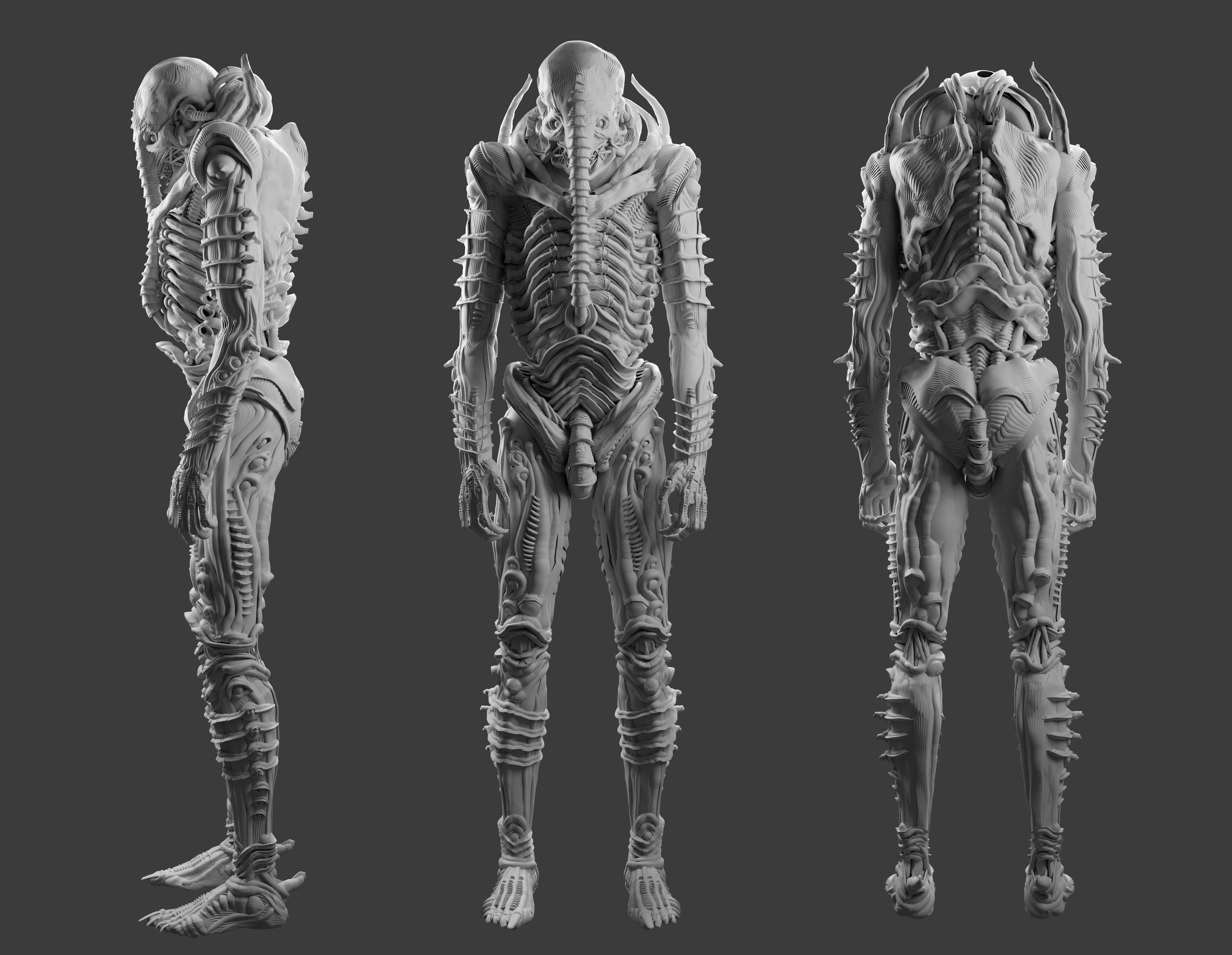
What if Ridley asked Giger to build a standing suit for both the Alien AND Space Jockey during film production? This was the central mindset I put myself in while designing untouched aspects of the Space Jockey. Things like its back, legs, bottom torso, and what it would look like alive. For continuity, I blended a bunch of details from Giger's suit for the Alien. I took a guess on how Giger MIGHT have designed this under Ridley's Direction.
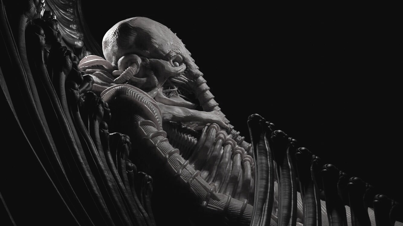
I’m basically taking the Space Jockey into monster territory. I imagine a living Space Jockey would look similar to the Alien itself. It’s black, slimy, has shiny human-like teeth, and an exposed jaw with rubber tendons keeping it together. Most importantly it's a gross mix of flesh and mechanical-looking parts. To me, the subliminal sexual imagery is what makes the Alien so striking. I'm definitely including this with sex organs that blend into each other. Unlike the Alien, in my short story, the Space Jockey has an exposed skull with eyes. The eyes are empty and black. Almost like space itself. So the general vibe is similar to the Alien. It’s hard to connect with it. Which is the overall point…Its’s alien to us.
I will upset some die hard fans by making the Space Jockey standing and not fused to it’s chair. I actually agree with them that the Space Jockey is much creepier and mysterious with this design. The “born into its function” element is very cosmic horror and I love it. But I also want to encounter it in immersive horror scenarios which would be hard if it were still confined to the chair. Besides the scale of it and visual design are more of important elements for me personally.
Even though I want to keep the Space Jockey mysterious I also want to add new details. I definitely need to be thoughtful/careful here. I’m taking a lot of inspiration from the character Nagilum. It appears in the Star Trek: The Next Generation episode “Where Silence Has Lease.” I love how alien that character is. Its really just curious and wants to probe. I think the Space Jockeys can have similar motivations. When they first encounter humans their instinct is to study and explore. Their methods are confusing > scary > violent to our human standards. Kinda like those abduction scenes in Fire in the Sky. I’m also taking inspiration from Dune’s Spacing Guild Navigators. Just like the navigators, Pilots in my story harness their power by infusing themselves with the Alien home world. Their technology grossly consumes the planet’s god like resources. This process is a sacrifice to their own bodies as both the Space Jockeys and planet fuse together into a grotesque byproduct over time. So in a way I am still including the “fused to it’s chair/born into its function” creepiness. And this lore idea wont even be explained or highlighted in the final experience. Just appear in various world building details.
In my story the Space Jockey communicates telepathically by implanting information into the main character’s brain. The process is so disruptive to our human biology that it causes people to slowly go mad. As the story progresses memories and images mix becoming completely alien. To create such imagery I started using AI as an art/design assistant. This workflow helps me design beyond my imagination/time allowance while maintaining the original design, just in an altered state.
Poster Design
I want to capture a familiarity with the 1979 Alien poster while also glorifying the hero creature in this story. My poster design pulls reference from Giger’s film design book “Giger’s Alien.” That cover is a perfect example of his biomechanical style. The creature and background are fused together.
Another aspect of this poster I want to convey is the horror mood. For the final design, I dialed up the cinematic lighting and even added a “flashlight” pointed at the Pilot. As if this is the first face-to-face moment. I put this light source lower since a human is less than half the creature’s size and would naturally hit that part of its body first. It also puts the Pilot’s face in shadow, amplifying the sense of unease.
Characters
The character’s motivation is similar to the Biosyn characters in Jurassic Park. They (Tyrell Corp employees) are chasing the more advanced Waylin Yutani teams to the Alien home planet.
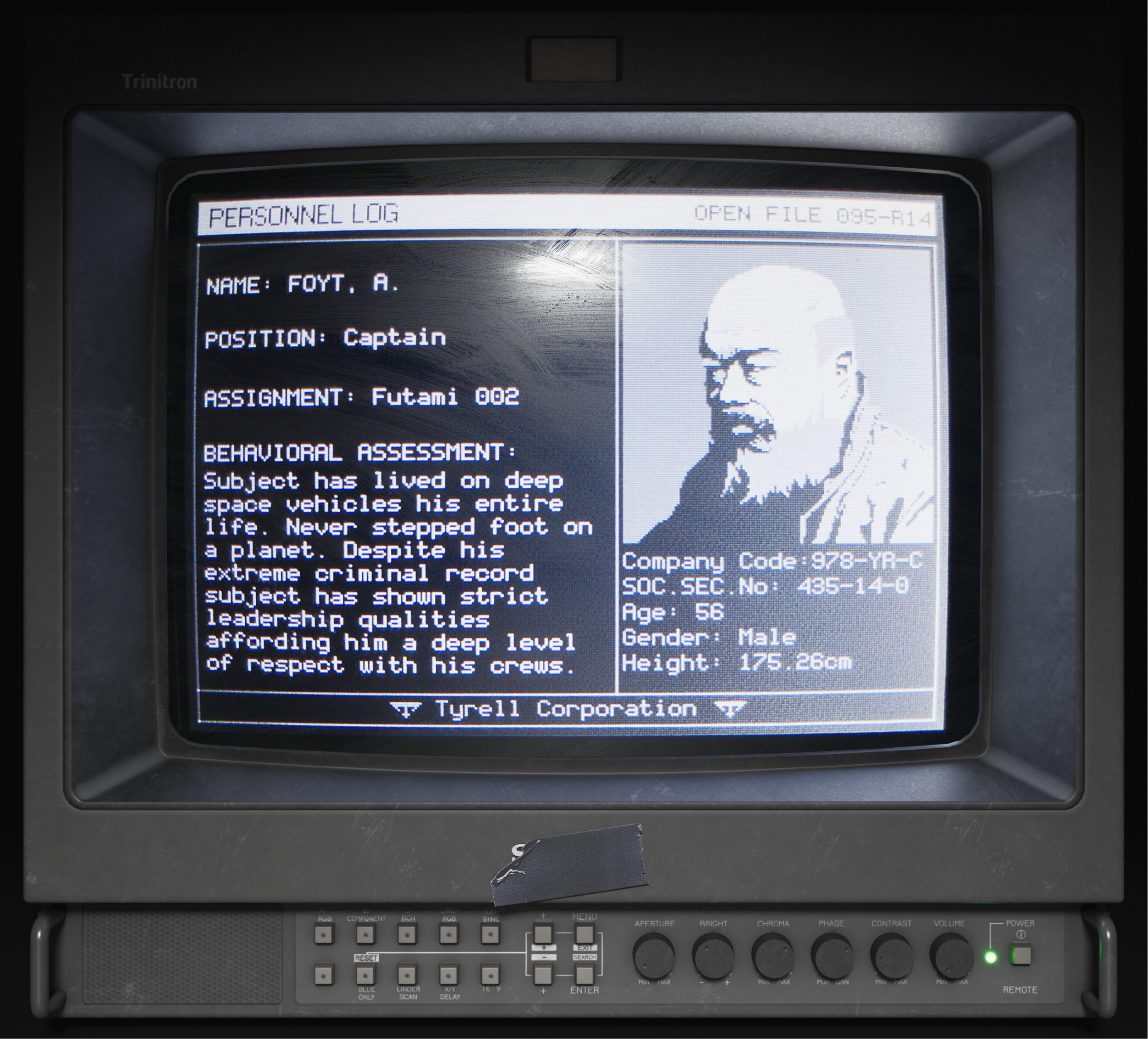
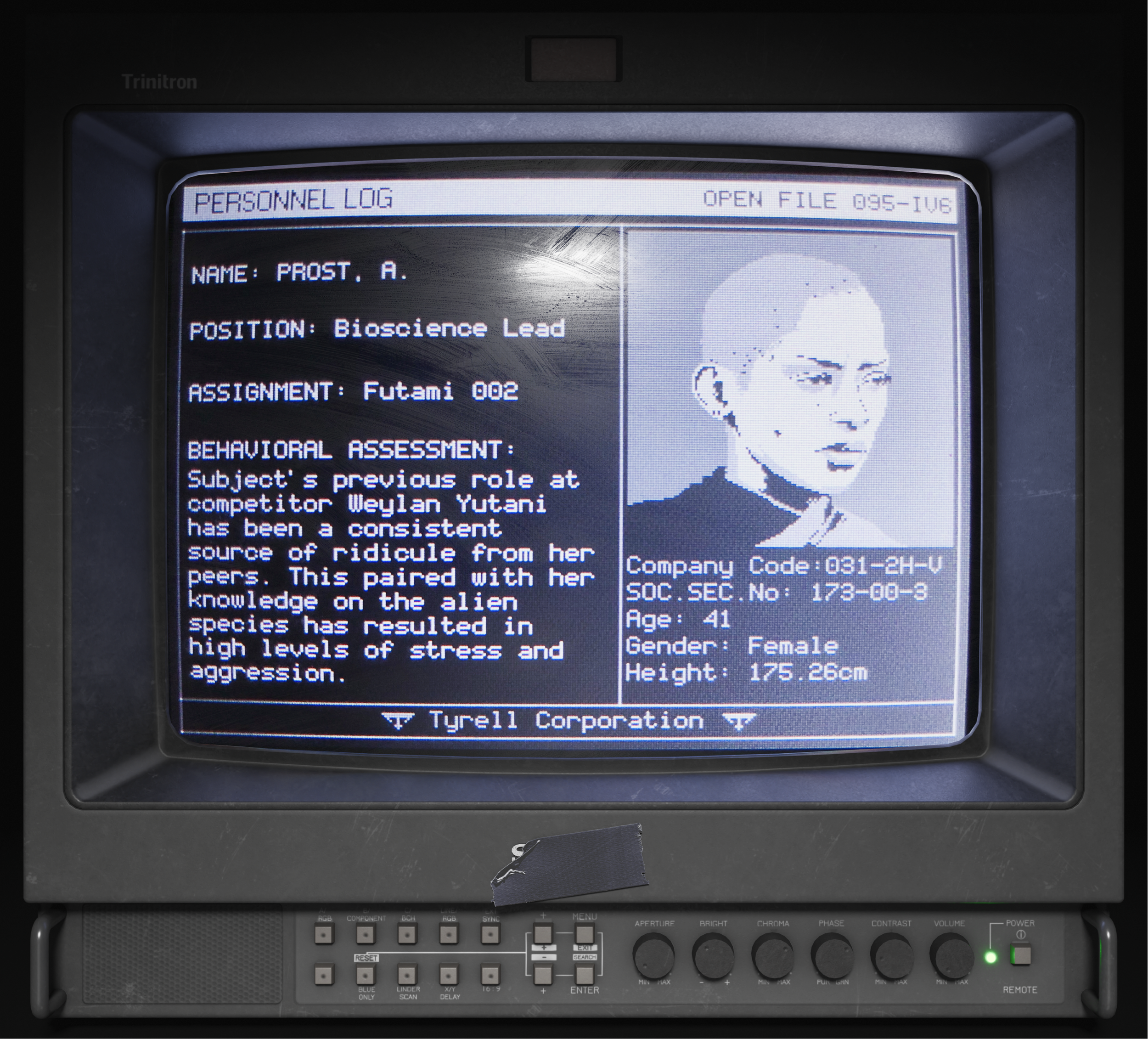
Characters were drawn from real reference with mods to features and details. To create the screen filter I designed the UI to 240x320px, displayed it on a 2.2in screen, and captured video of the screen on my phone. Got the idea from how developers created the in-game screens for Alien Isolation.
Layout heavily inspired by the prop work of Adam Shefki with a dash of Alien Isolation's screen designs. Info fields inspired by the debrief scenes in Aliens and Blade Runner. There are Easter eggs 🔍 Sound used for these monitors in the VR scene is from an Intel 486DX2 boot up.
World Building
For PILOT I'm combining the word of Alien and Blade Runner. Tyrell Corp and Weylan Yutani both play a role in the story. Therefore a lot of the human elements feel appropriate to those universes. My overall approach is to make the world of PILOT feel like 1979 Alien at first glance. The secondary impression is to notice the Blade Runner influence. Basically, I combine the design styles of Ron Cobb and Syd Mead.
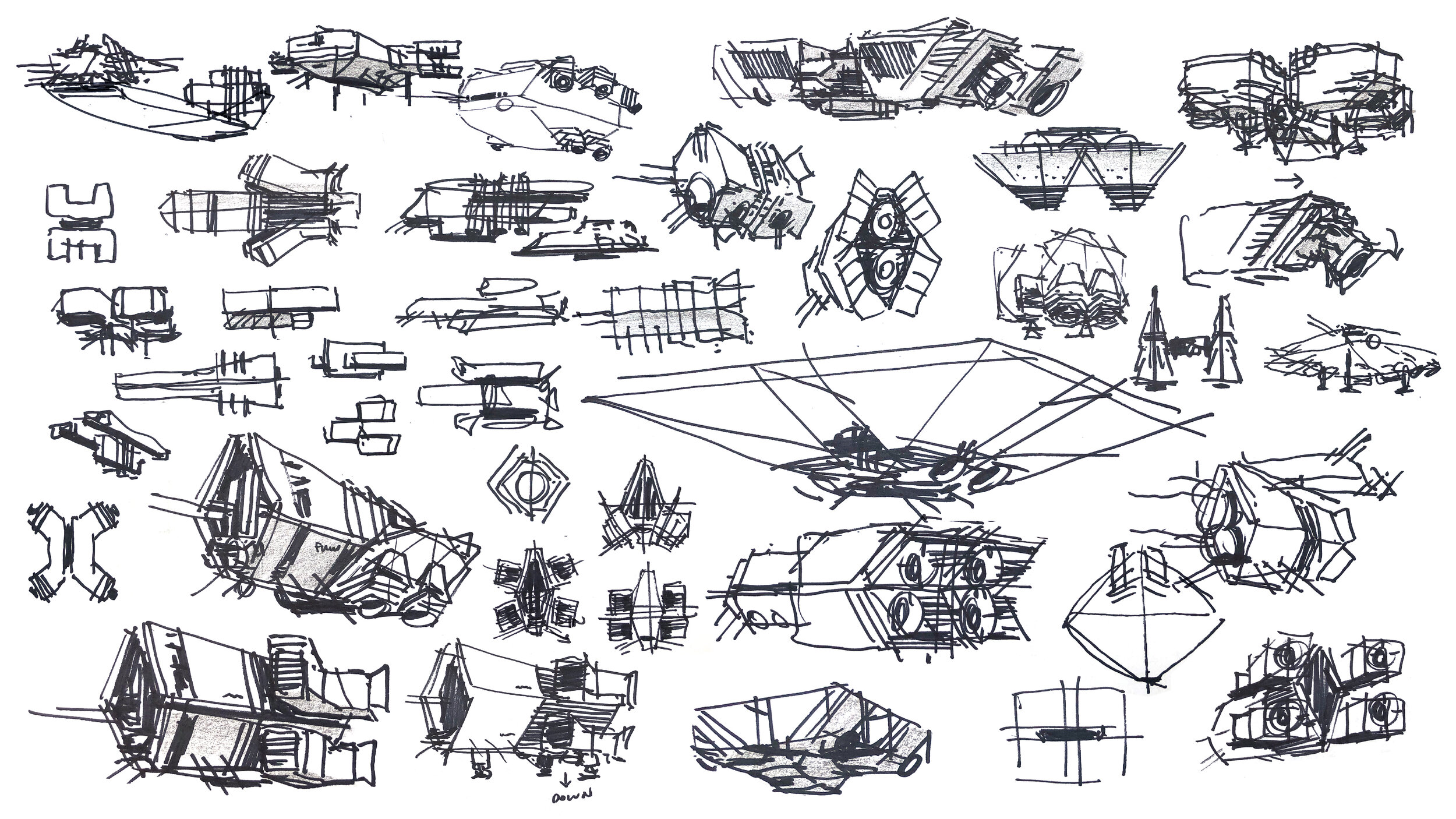
To design the world of PILOT I start with a thumbnail sketch while the idea is fresh. I'm often juggling references so sketches help me puzzle it all together. It's like a practice run before I jump into Quill and push the 3D design. At this point, I'm thinking about what's important for the story, viewer, and optimization. From there I render the geometry for lighting reference. Finally, I go back to Quill where I paint the light by hand to match the rendering.
Tyrell Corp Logo Redesign
Took a stab at redesigning this logo (briefly seen in Blade Runner) since it will appear throughout PILOT. I removed the owl reference and simplified the “T” I also wanted to contrast the Waylan-Yutani logo which is softer and has visual references to wings/feathers. Tyrell is a company focused on synthetics and thus the logo also feels machined. If Waylan is like the oil giant of the future then Tyrell is the tech giant.
Icon System
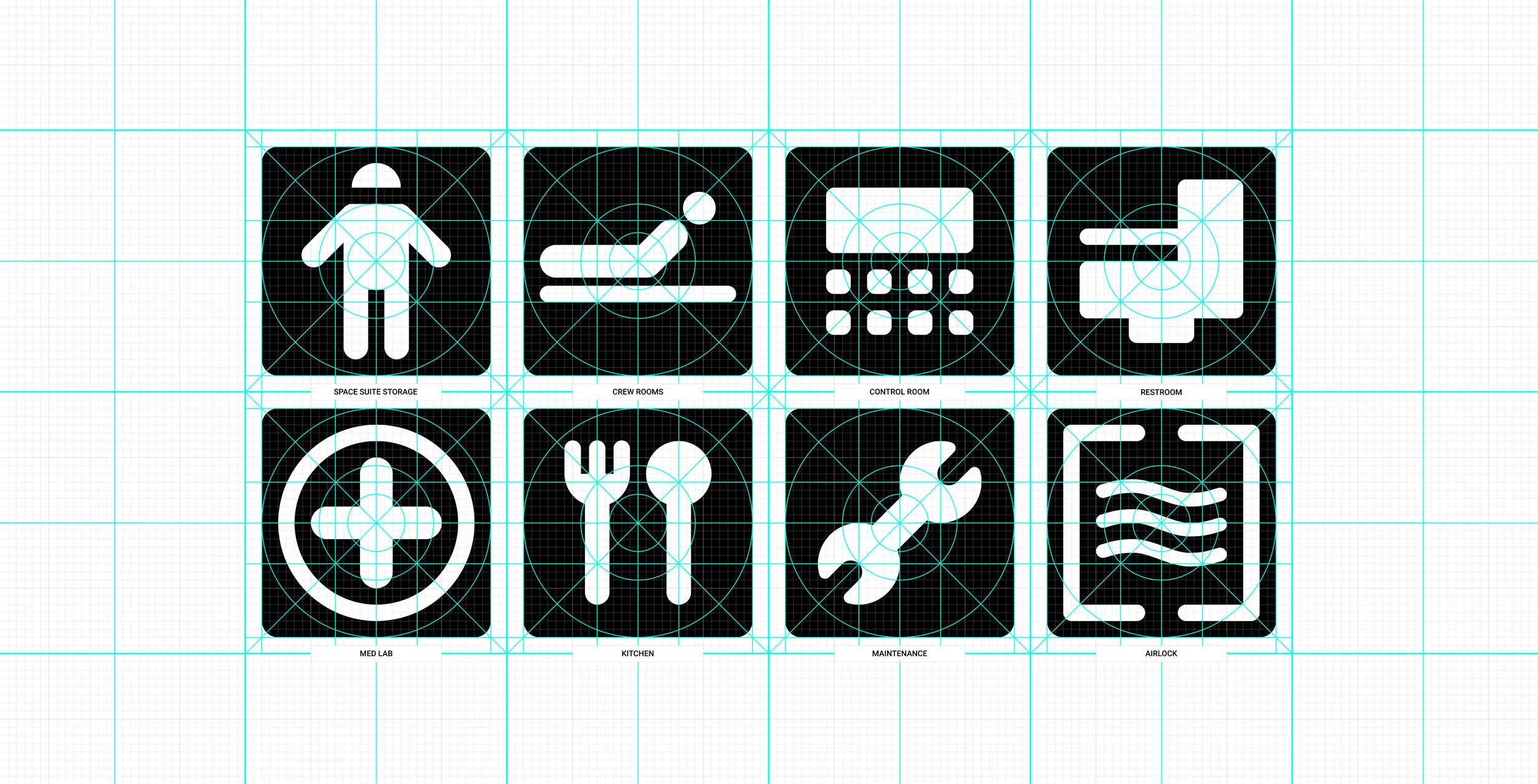
Ship wayfinding and screen icons - My design here is directly inspired by Ron Cobb’s Semiotic Standard icons from Alien. With a few variants on the system. I made everything rounded (lower res for the screen icons) and monochromatic. The red acts as a attention grabber, similar to exit signage, for the crew. To the audience, the red accents the monochromatic blue environments and adds a layer of world building detail.
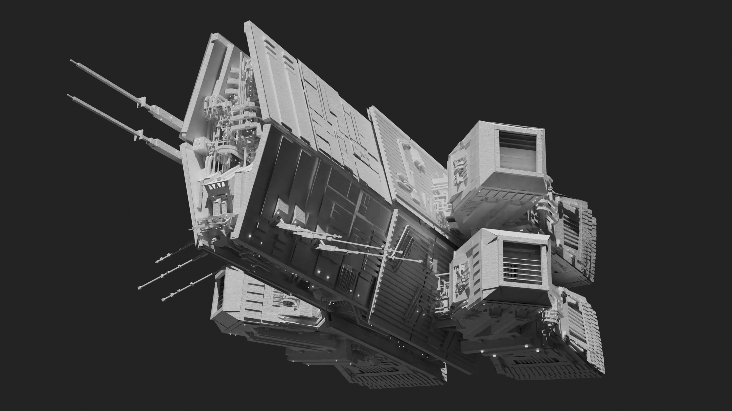
Orbiter Ship
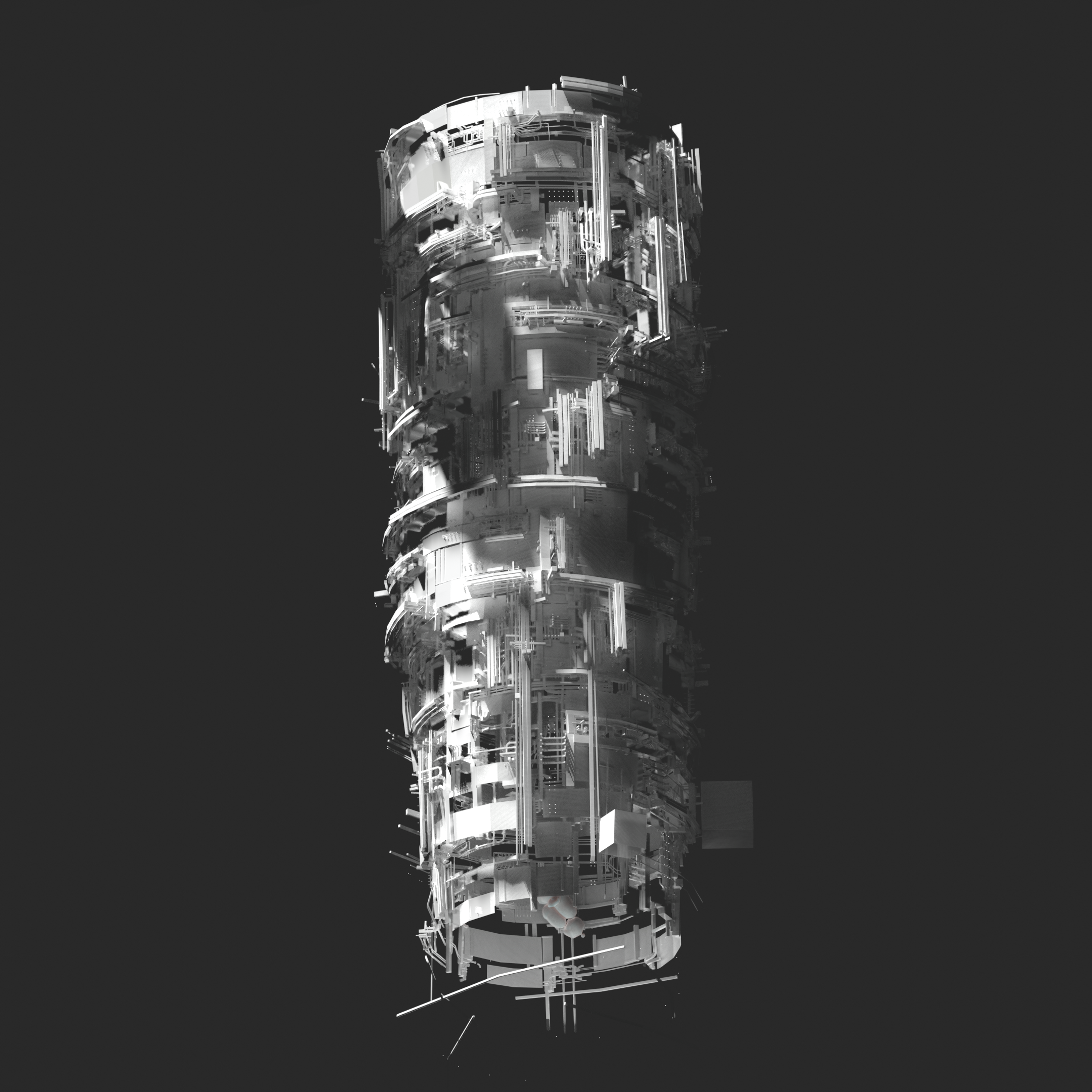
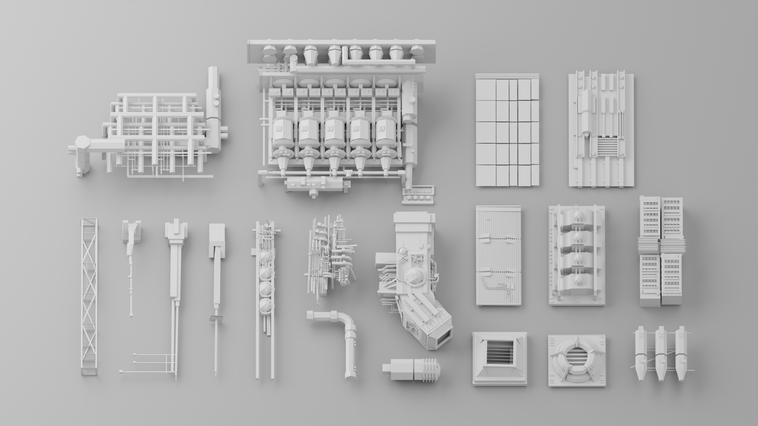
My initial designs took the pyramid buildings from Blade Runner and flipped them upside down…A trick I learned watching Total Recall’s behind-the-scenes. But after some exploration it felt a little silly for the world of Pilot. So I went back to the industrial facility inspiration that inspired the Nostromo’s look. The final orbiter design mimics oil rigs and research structures out at sea. Kitbash details (greebles) are a mix of Alien, 2001, Star Wars, and some 1970s spacecraft concept art. I went with an overall dark look to contrast the white dropship. The elevation silhouette is in the shape of a “T” for a subtle reference to Tyrell.
The Dropship
Designing a spaceship is like designing a logo. Feels like everything has been done and every angle explored. It took me a while to land on a overall concept I was happy with. I basically frankensteined Syd Mead and Ron Cobb. Since my story merges universes I felt its fair to merge designer references as well. I also combed over model details, in Alien, to capture the kitbash vibe.
Ship Interiors
The design is a mix of Alien and Blade Runner's living spaces. As the story progresses so does the mood of the interiors. Each set progressively becomes darker evoking a sense of growing dread and fear. This also helps me limit detail since most areas will be in pure shadow.
The workflow for creating each scene is very labor intensive. The final assets are hand painted, detailed, and optimized. I’m constantly asking myself if this is too much but I think it will pay off in the end. As creation becomes more accessible and automated with AI, I believe works that are a labor of love will have higher value. Doing things the long/hard way give things a sense of weight and pride that automation cannot. The audience can feel that.
The Decision Scene
This will be the most important scene in Pilot. If I can make this work then the rest should fall into place. It has a long way to go but the project finally has a pulse.
For the voices I used speech to speech synthesis (my voice performances with filters layered on). Only to flavor the characters. This animatic will eventually help me direct voice actors. It desperately needs their performance.
Learnings from the Animatic test:
The only way I can ever finish Pilot is to animate characters via pose to pose. Maybe add some in-betweens after release if I have the energy. I got better at pose to pose animation and walk cycles through this animatic but I have a long road of improvement ahead.
No lip syncing. Possibly binary (open/close) anime style mouth movements. But I need to test this and see if it looks corny.
Use background ambience to reinforce tension. Like in Alien I used a rhythmic industrial “heart beat” pulse for the ship's ambience. I made it increase/decrease “heart beat” tempo based on the group's mood. Oddly enough I got this idea from how the cowbell pitch changes melodically throughout the song “Owner of a Lonely Heart” by Yes. I also increased the background presence during pauses to increase the “silence” and uneasiness.
Updates:
The script is now more coherent and sharp. It was hard to follow since I was leaving out specifics that glued things together. I trimmed pauses and reduced character dialog to shorter burst. You can really feel when things get too long in VR. Especially in the middle of this scene. Expressionless faces don't help either. There's not much for the audience to study during the longer portions.
I added more foreshadowing to what the characters will face later on. The first draft retreaded too much territory from Alien and was way too bloated. It's sharper and focused now.
The main climax of this scene is still not yet justified. The middle part of the convo goes a little off track making it harder to snap back in. Maybe actor performances can help set up the main line. Or the scenes leading up to this one could have little seeds planted to help set things up. Not sure yet but this is where I need to focus next.
Alien Home World
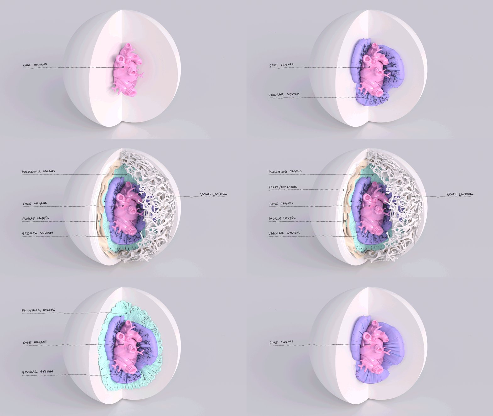
This will be the second vertical slice for PILOT as its a direct contrast to the human scenes. Everything will be organic and flesh toned. This all goes back to some of Giger’s gross landscape work.
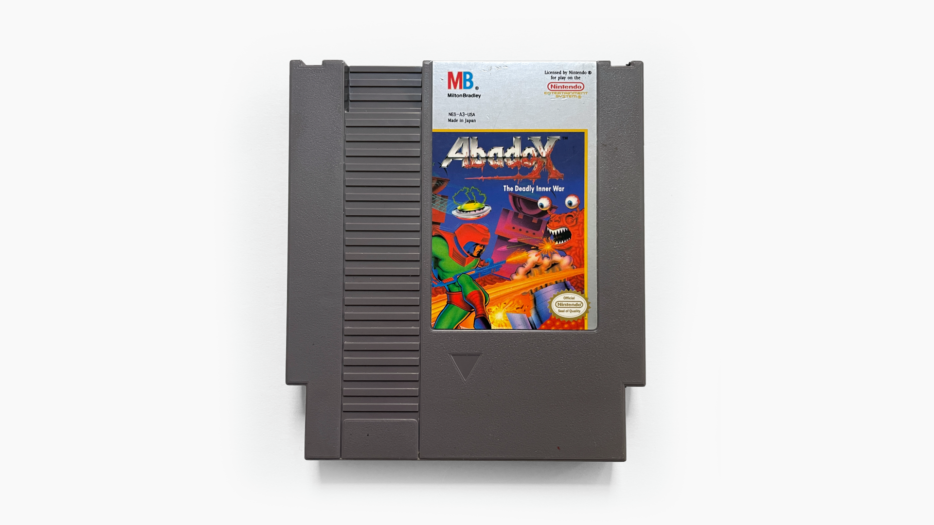
I remember reading somewhere that Giger envisioned LV426 as one big organism. But for budget or thematic reasons the idea was scrapped. Since my story takes place on the thriving alien home world I decided to bring this idea back. Theres been a few things over the years that take on this concept. One that comes to mind is the NES game Abadox. Its a fun snapshot into the gross world I would like to create for Pilot.
More thoughts I want to include in the experience: Rhythmic quakes shake the ground as the planet’s immense organs pump rivers of fluid, from the core, throughout its expansive vascular system. The characters boots mush into the fleshy surface triggering muscle fibers to twitch a few meters below. Landing causes immense violence to the planet’s surface. On touchdown massive bones crack and rupture through the surface which cause rivers of organic fluid to escape from the deep gashes. The air is hot and thick with low clouds of gas floating by. Even with pressurized suits you can taste the planets unbelievably horrendous smell. It's a changing palette of copper, moist flesh, and yeast.
Not only is the alien planet a big design challenge but the Tyrell Corp space suits as well. For the final design I referenced Moebius’s pre-production sketches, from Alien, and layered on organic elements from other films. There's also a thematic similarity to the Space Jockey for suggestive story reasons.
Adjacent Projects
Pilot has been a great vehicle for learning. I work on these little side projects in parallel to the main production. Learnings from these projects make their way back into the main production one way or the other.
—
“Bio-mechanical Interface” details the Space Jockey’s technology and how they might interact with it. I imagine it to be like the scene in Predator where the creature repairs itself in the trees. But for Pilot more gross and organic.
This was sparked from an exercise in making my renderings less “clean” and more oddly textured.
“Bio-Excavation Facility” explores events after Pilot. The Alien planet is a bio-mechanical organism. The Tyrell Corp has set up a facility to excavate the planet’s organic surface layers.
This was an exploration into “fear of heights” for VR, as well as, viewer agency in Quill.
“Mashed Parts” explores what other indigenous life on the Alien planet could look like. There are parts from the Alien species and the Space Jockey. This is a head from one such indigenous creature. Probably a giant like the Space Jockey.
This was an exercise in kit bashing parts, and trying new materials, for fun.
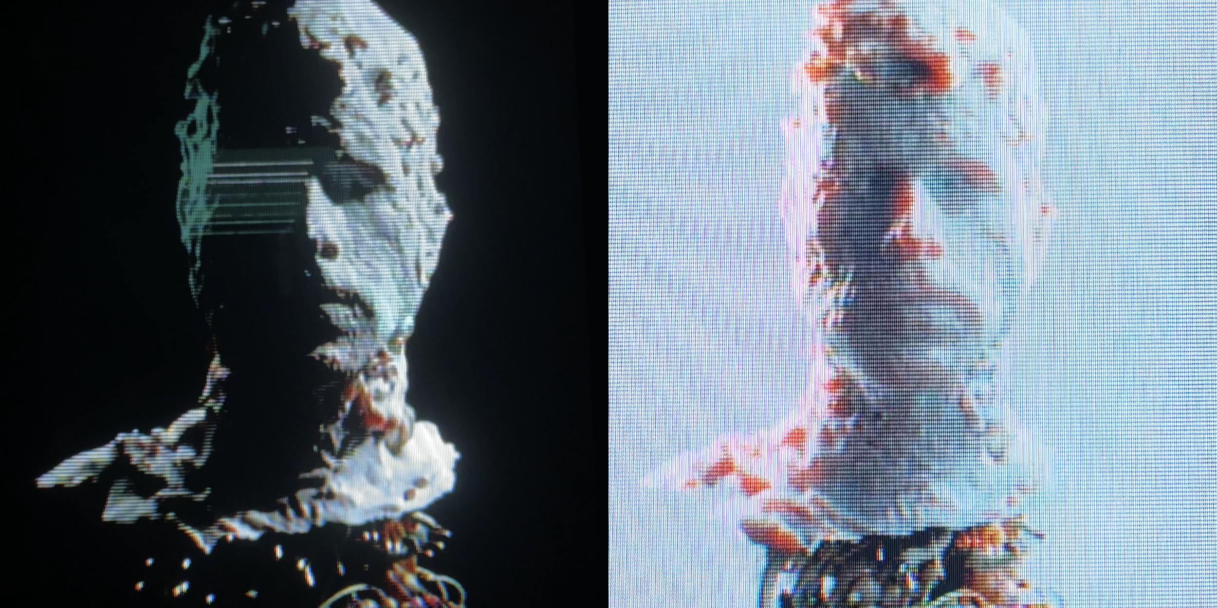
“Projections” started as a 3D scanning test and ended up as a weird experiment for all sorts of things. The 3D scan results reminded me of the scene in Alien where the crew interrogate Ash. So naturally I had to capture that vibe. This became a nice study of all the practical details in that scene.
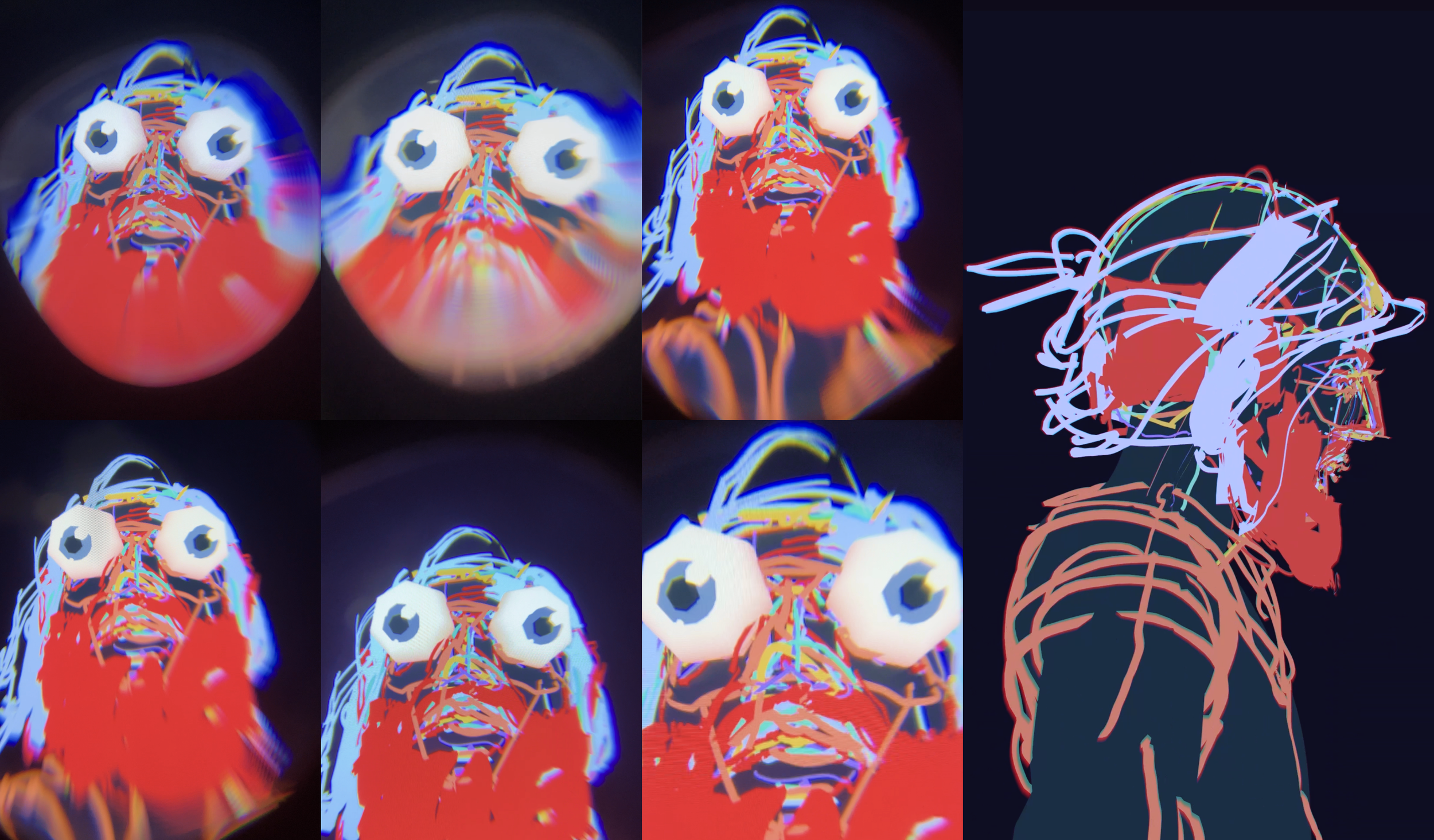
“Wireframe Weirdos” was me having fun while working on an animatic for the decision scene in Pilot. I created puppet style rigs for all the characters and decided to be playful with the rigs vs. actually working on the animatic.
Learnings From a Years Long Personal Project
Half way mark (5 yrs) insights:
Motivation via small and frequent milestones - To keep myself motivated I create mini milestones along the way. Usually in the form of strategic sub projects. Each not only adds to the overall project but also help me learn and grow.
Allowing off ramps to happen lead to new directions - I get bored of this subject/project from time to time. It doesn’t always fit into my top of mind creative interest or goals. So sometimes I take parts of Pilot and use them to explore elsewhere. Since the content is rooted in Pilot it can come back and add to the overall project. But it doesn’t have to and that freedom is what allows for creative expansion. Its only later do I find ways to bring these off ramps back in. And in that flow I have more creative freedom to find exactly how they can integrate and contribute to the main project.
A sandbox of experimentation to test changes in the world - Over years the world, tech, and myself go thru big changes. One major change has been the gen AI revolution. In many ways I feel spiritually connected to Phil Tippett and his Mad God project. There he experience a similar situation with the digital (CGI) revolution in the 90s. One way I’ve deal with this disruption is to use Pilot as testing space for these emerging disruptions. In this project I can explore how to integrate AI, not just from a workflow perspective but narratively as well. I can also slowly discover where the thresholds and parameters are. Its not about converting Pilot to an AI project but using it as a sandbox of experimentation.
Pilot grows with me - There are sparks and seeds to Pilot. Universal ideas planted in the start that will show up in the final result. DNA basically. But this project will evolve as things emerge and I myself grow. Allowing for the project to evolve with me frees up a lot of pressure. In many ways this project is more like an organism than a static pipeline. It has a DNA that will remain but can organically change course over time. All projects evolve but rarely do experience that connection with your personal evolution and changes. Its much more clear when your synced with a project over longer spans of time.

