Designing in VR
This is a collection of thoughts around my ongoing experimentation with VR as a design, prototyping, user testing, storytelling, and visualization tool.
I was lucky enough to speak at Interaction '18 on this topic. The video on my talk is no longer available but my (current) thoughts are below.
Resources:
Why VR?
VR revolutionizes the way we interact with computers. Users can leverage physical inputs like their head, hands, eyes, voice, and body. They have way more to work with. This is especially powerful when these inputs are working together in concert. The sketch below is a slide recreation from Michael Abrash’s OC6: “The Future of VR” presentation where he perfectly articulated this point.
VR also enables higher levels of user experience with things like immersion, scale, embodiment, agency, and presence.
As a VR designer, you will become a multi-disciplinary force of creativity. Spatial designers will need to think about interaction. Interaction designers will need to think spatially. Static artist will explore animation. 2D designers will pick up 3D and so on.
The Beginning
I’ve been obsessed with VR since the Oculus Rift’s 2012 Kickstarter and had a chance to demo the DK1 at the Bay Area Maker Faire (2014 I think) which sealed the deal. I finally got my hands on a DK2 in 2015 and quickly learned Unity. I spent a lot of time digging through forums to troubleshoot problems and share solutions. It was a wild time. Anything was possible and it felt like we were all on a crazy adventure to find new patterns. I remember specifically having conversations like: “How in the world is locomotion going to work?” At the time free locomotion and teleportation wasn’t yet establish as a common UX pattern. “Do we need a warehouse to walk around?” “What about this crazy idea of redirected walking?” I knew right away we were in a very special moment in time.
VR + Architecture
My first professional experience with VR was in Architecture. My goal, at the time, was to find the value VR could bring to architecture, and spatial design, while at Gensler San Francisco. So naturally I gravitated to the lowest hanging fruit…visualization. I discovered that high fidelity (realistically rendered) 3D environments were great for interactive visualization but required a separate work stream, lots of effort, and could never keep up with iterative design workstreams. If VR was to work as a spatial design tool, the workflow had to be more integrated and keep pace with the core design workstream. Basically real-time. So Low/medium fidelity VR content became the sweet spot. This was a time before tools like IrisVR and Enscape 3D solved the real-time + fidelity problem. Now its as easy as one-click and your in VR. And its real-time rendered!
This was one of my early test scenes in Unity 5 that included a VR camera (OVR player controller not in video), player controls, crude character AI, proximity-triggered audio, a hacked together mini-map showing real-time player tracking, and Unity's lighting system.
I also experimented with basic AI in Unity with the hopes of testing various in-store conditions. This test simulated 3 checkout types, 10 different shopper behavior types, and some randomness added for the employees (card failures, bagging time, etc). The above GIF shows the beginnings of that simple effort.
Usability Testing in VR
Even though visualization was low hanging fruit I found the most valuable use case for VR in architecture was user testing. User testing is rare in architecture for many reasons. You need to either build a portion of the design via foam core models in a warehouse, lay tape to mimic a 1:1 plan (See the movie “The Founder”), or build an actual working store in a warehouse and test. Only Apple, P&G, Walmart, and a few others afford to do this. All these options are time-consuming and expensive. But that’s where VR comes in. It enables architects, and spatial designers, to user test their designs in real-time and at very low cost.
One example of usability testing in VR came from the need to design a complex café checkout experience. The team was having trouble aligning on a direction. The problem was our lack of understanding of how people would ACTUALLY navigate a complex space like the one we designed. VR was the best tool for getting testers in the design and observing them complete simulated tasks. I started with a test script, set up our 3D models for testing, and had users role-play a few scenarios. Hidden problems with the design were uncovered immediately and some of our hypotheses confirmed.
Testing often and doing it IN your design is so so critical. We know this in digital product/UX already. But with VR architecture finally deploy the same design practices. I strongly believe every spatial designer should include VR into their toolset to complete the capabilities loop. Which is something like:
Design tool (Fast 3D modeler like SketchUp or Blender).
Testing tool (VR).
Build tool for BIM (Revit).
Learnings from usability Testing in VR
Limit locomotion.
There are certain locomotion conventions in VR that give users movement "superpowers." This encourages testers to travel through the experience at an unnatural speed, which can affect the data output.Standing "room-scale" VR over seated VR.
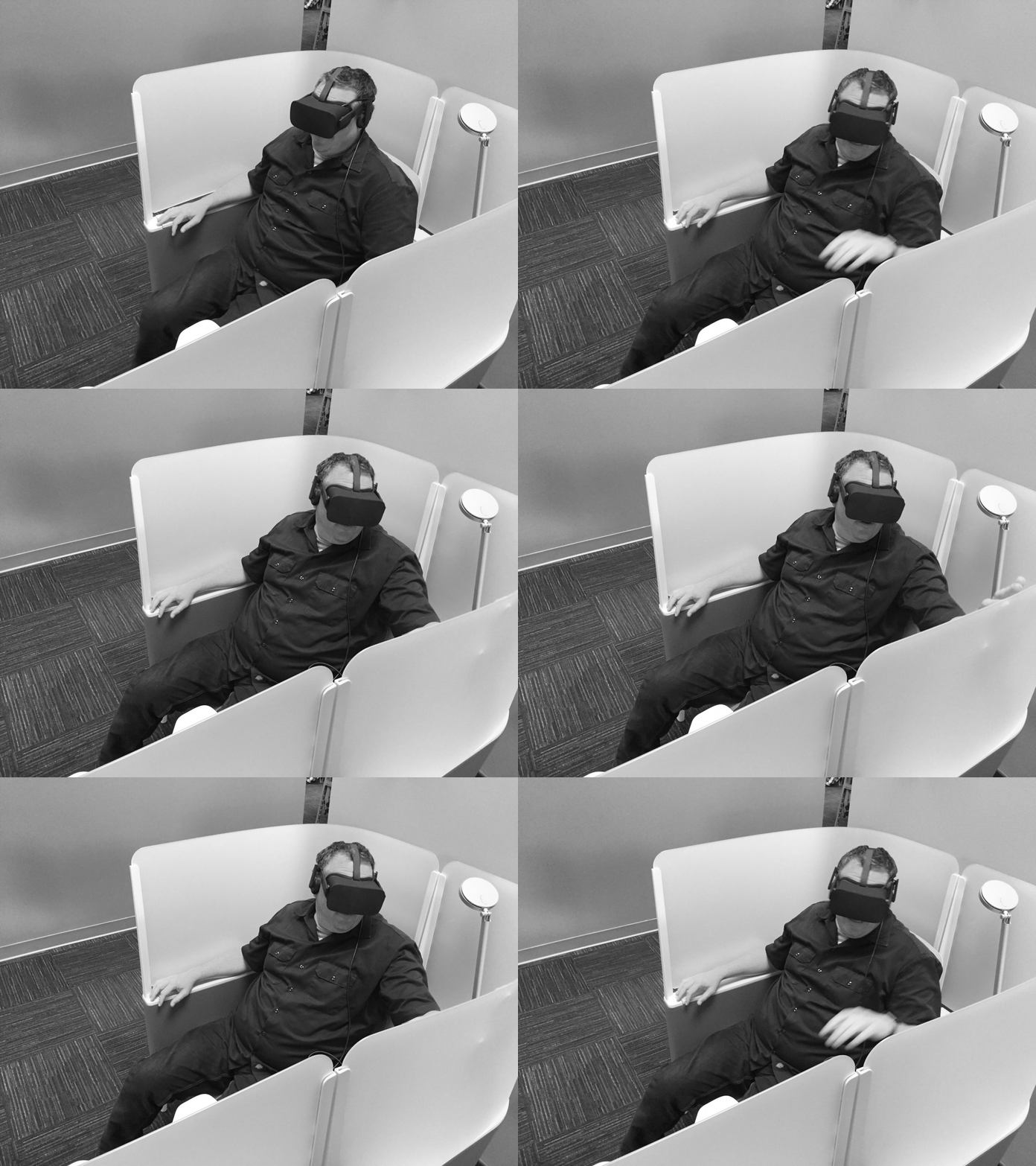
Standing VR helps testers feel more engaged in the space as their scale and eye level are more natural. This also encourages them to look around naturally instead of swiveling in a chair.Allow time for testers to get comfortable in VR before running the test.
You don't want testers taking mental energy away from completing their task and verbalizing their thoughts.Focus the VR content (3D models) on how the space functions.
If details or aesthetics serve a functional purpose then include them in the 3d model.Moderator participation is necessary to carry out complex interactions.
This will get exciting soon when multiple VR users are able to interact in the same room. Role-playing as staff (moderator) with customers (testers) in a VR environment will become common practice. Update: IrisVR, the Wild, and other VR tools are focused on multi-user collaboration.
Sketching Architecture in VR
Creative VR tools, like Quill, allow designers to sketch spatial concepts at the same speed as doodling on paper. The added benefit of a VR sketch is the designer now has a 3D artifact that they may explore at scale.
VR as a Prototyping Tool for Architecture
This example shows how easy it is for spatial designers to jump in and out of VR with "one click to VR" solutions like Enscape 3D and IrisVR. This workflow allows designers to set up a design/test cycle without building out separate workstreams. This video also shows how to use Unity, with VRTK's prebuilt VR mechanics, to prototype design concepts. Unity is great for interaction and dynamic elements like simulated video panels.
Demoing VR
For most of the people demoing VR it will be their first introduction to the tech. This means pre-planning the demo's UX is crucial if you want your participants to retain the content you prepared. Most likely the participants will only have enough mental load to appreciate the fact that they are in VR. For that reason, the in headset content is often overlooked. To combat this simplify the number of things the VR user needs to learn. Removing control options and abilities free up mental load which will help participants focus a little more. Comfort features also ensure participants leave with a positive experience. These options may include a seated VR version. Also consider movement options, like teleportation and snap rotation, for the standing demos. Finally, consider the social aspect of demoing VR. Avoid scenarios where the VR user feels like they are on display. If they feel like they are being watched they may be reluctant to try.
VR Tools for Spatial Design
Lo-Fi Prototyping in VR
Sketching your ideas, or even bringing in your flat UI designs, in Quill is the fastest way to test how a design feels in context (IMO from professional experience). This is especially useful when you're trying to find those sweet spots between UI size and spatial position. Animating your design takes it even further by allowing you to mock functionality intent and communicate flows to your team in headset.
Example: Visualizing VR Mechanics (Gun Game Sketch)
Complex object interaction is one of the more fun aspects of VR because it brings together all your physical inputs. Playing with objects that mimic physical interfaces in VR, allows users to manipulate tools with powers beyond reality. It also taps into a child-like fascination with buttons, switches, and other physical interfaces. In this concept players are challenged to a procedural set of weapon/tool scenarios during gameplay. This puzzle of scenarios would create a dynamic player experience where they need to power on, repair, recharge, reload, unjam, clear, toggle modes, unplug/plugin, open/adjust, etc. This all happens while the player is facing a dynamic enemy and environmental challenges. This motion sketch is a quick way to communicate some of the intended interactions before jumping into detailed assets and/or code.
Example: Designing AR in VR (G Maps Sketch)
This mini-project demonstrates how designers can use Quill to concept AR UX and place it in situ with the Wavy Music app. This project explores what Google AR Maps UI (2018) for your car could look like. To make sure the layout was accurate I imported a scale 3D model of my car into Quill for reference. This reference also helped when positioning UI components outside the driver's required FOV. I used my phone to visualize the UI but in reality, this could display on the windshield. The UI components are based on Google's 2018 AR Maps announcement. All the UI components are shown at once so you can see the whole set. This is not a UX flow. Seeing all this animated UI at once would not be ideal in real conditions 😄
2D Design Tools vs. Designing Directly in Headset
A question I get a lot is “what does a VR design workflow look like?” A lot of new designers to the space assume the work is only done in VR. The short answer is your going to be working both in VR and 2D. Traditional UX/UI tools, like Figma, are still VERY important when designing for VR. A lot of the time your design is best laid out in 2D first. Just like how some architects design in plan view before moving on to 3D. You're working out elements of the design that are better controlled via 2D. The core reason to use 2D design tools is for creating, and maintaining, a design system. Grids, alignments, color and type styles, component libraries, precise layout variables like margins/padding, z axis dimensions, etc.
One trick I learned designing between 2D and VR is to set equal conversions between pixels and real-world measurements. Since everything in VR is set to metric units (or imperial? I hope not 😄) just make one pixel equal to one millimeter. That way engineers can easily understand your 2D design dimensions when inspecting mock-ups for VR.
All that said I’m a huge champion for designing directly in headset. There are problems and discoveries that will be hidden until your in situ. I’ve experienced these type of discoveries many times. I’ve also seen ideas, I know could be better, not take off because they weren’t designed directly in VR. It’s similar to car design where you have a killer concept sketch but when it’s time to model in 3D you realize it doesn’t work. Another way to think about it is limited input = limited output. If your designing on a platform that doesn’t allow for all the inputs VR does then your limiting potential output.
Additional thoughts on VR UX/UI design:
Direct Touch vs. Ray Cast “Laser Pointer”
I see a lot of apps that default to one interaction model. While I understand this reduces cognitive load for beginners, and is a cleaner approach for engineering, I don’t believe it’s the optimal user experience. Half Life: Alyx proved multiple locomotion interactions, used in concert, can empower users with new heightened abilities. I believe the same is true for the direct touch vs laser pointer debate. Why not allow for both and design around their unique strengths? For example near field UI/menus in VR are much easier, and a pleasure to use in my opinion, when you “touch” them. Direct touch also allows for greater finger input manipulation. Sometimes you need distant UI to make things bigger. Like images and text for browsing. Sometimes you need near field UI for functionality that carries with you thru the whole experience like search, settings, mute, or privacy. Or maybe you need breakout-UI for things like playback controls. Different use cases = different solutions.
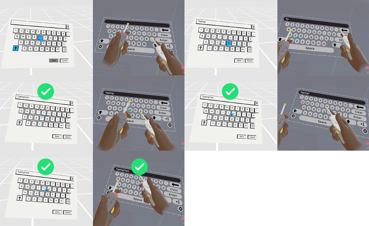
I personally gravitate towards touch interaction, and would like to use it as much as appropriate, because it takes advantage of VR’s unique affordances. It’s a differentiator. When done right, touch can also be more responsive. Take the example of a keyboard. With touch you’re quickly “tapping” around but with a laser pointer it’s a trigger press and release for each tap. The operation has one extra micro step which really adds up when you're typing a lot. I believe the ultimate way to type in VR is with voice but that’s a whole other topic. The main problem we face here is mass adoption. Direct touch has kinda been put in the long press, or thumbstick press, category of patterns that users havn’t adapted broadly. But to me this is something worth training a new gen of users so that we can slowly mold better UX behaviors in VR. Versus giving in to current mindsets and risk never reaching a better UX landscape. Or worse, we don’t give people enough reason to drop their convenient 2D devices and HMDs slowly fade away.
3D vs Flat UI
Seeing flat UI, spatialized panels and buttons, in VR just feel unfinished to me. As in it's an interim compromise for a more 3D future. I know 3D UI can be very expensive (perf cost, draw calls, etc) but I think it's worth the investment to solve for perf cost if your app/platform is UI heavy/focused. Creation tools, utilitarian apps, and OS for example. There are some areas where 3D is not worth the cost. Distant UI such as large discovery walls, info panels, etc. There are also some special cases with near field UI that don’t need 3D. Drop down list for example. But my general approach is to make almost everything in your personal space 3D.
3D UI just makes VR unique and fun. Its a clear differentiator that helps address the question “why should I put this thing on?” But it’s not only about a “nice to have” experience. 3D is also functional. Flat buttons can be mistaken as disabled or not buttons at all. 3D is just more “tappable.”
Controllers vs. Hand Tracking
We use tools for a reason! Yes, hand tracking is great for casual users/use cases and will likely be the primary input modality for Ray-Ban size AR. However, I don't believe hand tracking will replace controllers in VR. Just like all these VR debates I think the right direction is to offer both options and design towards their unique strengths. I'm pretty confident controllers will stick around based on what we (public) learned in previous efforts here. Xbox Kinect is the example that comes to mind. The optimistic vision for Kinect was a controllerless future. However, that didn’t happen for a number of reasons and we still have controllers today. Controllers have been with us since the first video game console for a reason. The Vision Pro also has proven eye + hand tracking have a usability ceiling. Controllers are still undefeated 😆 I'm not saying the form factor is perfect and shouldn’t be innovated. It's that controllers, or wearables like gloves, allow for critical affordances. Mainly feedback, presence, and a greater number of inputs. So complex use cases, like VR creation and it's pro users, can access as many inputs as possible with greater freedom to combine operations. Most importantly controllers enable multi-tasking. As the Vision Pro has shown us, you need the ability to decouple inputs. Your hands can do things, while your eyes, head and body do other things. Still working together in concert just with greater freedom.
One key use case here is brush pressure sensitivity for VR painting. As a pro creator I need the physical trigger’s spring tension feedback so that I can be as precise as possible with things like stroke weight and taper. Without this physical feedback, features like brush sensitivity wouldn’t be usable. I also look at it like this - sure you can play drums out of thin air. There are actually products that make it possible. But why? Drummers need something to hit. They need the feedback from the instrument if they are to play it with skill.
Or think of hand tracking in games this way. . . Do you want to play HL: Alyx by my making a finger gun and saying “pew pew”? I’ve tried it. Def does not replace controllers.
Learning from the Best: Thoughts on Half-Life: Alyx’s Design
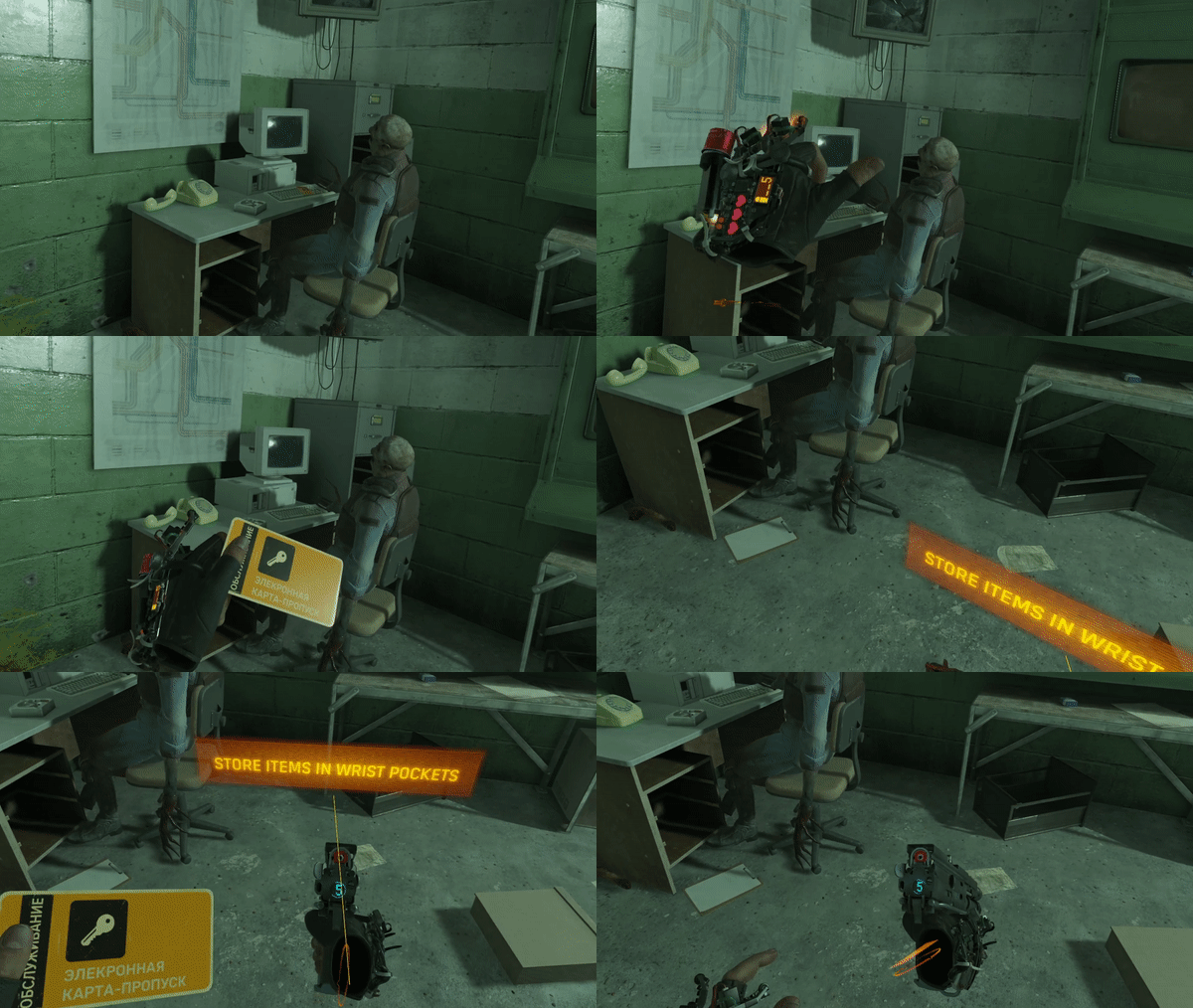
The best VR game/experience to date, in my opinion, is 2020’s Half-Life: Alyx. It’s a 10/10 for me. One of my top 5 games of all time. It also hits on all the things I've mentioned here and has set the standard for many key VR interactions.
Locomotion
Before Alyx, most devs/designers struggled with choosing a primary locomotion design. It was hard to nail down a target audience. So one solution was to build all types and let the user choose. But which do you set as default? Gotta pick one right? Alyx came on the scene and said “why not allow for multiple locomotion styles at once?” The cool thing about this is I started using both locomotion styles in concert which opened up a whole new way of getting around in VR. The free locomotion speed is just slow enough that you're encouraged to use teleport for larger spaces in order to get around quicker. The slower free locomotion speed also encourages you to treasure hunt for useful items. When a head crab surprises you then just teleport away, line up your shots, and evade via strafing. Each locomotion style has its unique strengths which add to a whole new mental model for VR controls. Combining locomotion styles, and designing for “choice”, should be the standard for all VR apps going forward.
Quick Menu
To me this design is perfect. Keeping it to 4 options (simple axis layout) allows the player to select without even looking. Like shifting gears on a car. It's crazy efficient AND you feel super cool every time you use it. The design details are also a key to its success. The subtle follow, how the UI dismisses if you move out of the trigger origin range but you're still able to select, sound design, and so on. It’s worth getting in there and just playing around with this mechanic. It feels amazing.
Object Interaction
This is probably the more famous mechanic in the game as it really nails the problem of grabbing objects outside of your physical boundaries. Or items on the floor. Games like Blade and Sorcery pioneered the “Jedi grab” style mechanic but Alyx took it to a whole new level by adding a catch to further gamify it. To me this is its secret sauce. The team even went to great lengths with their trajectory prediction in order to find that sweet spot between feeling like a super power but also adding in failure/misses. It’s easy enough but you also feel like it’s something you can master. So you feel like a badass every time you pull it off.
Physical/Diegetic UI
Dead Space was one of the early pioneers of diegetic UI design. I recommend checking out Dino Ingacio’s GDC talk “Crafting Destruction: The Evolution of the Deadspace User Interface.” for the definitive details on this approach. Many VR apps have taken diegetic UI further, given the physical affordances, and Half Life: Alyx is my favorite example here. Each hand plays a role whether it's your right for checking ammo clip count or your left for reviewing things like health status. Other design elements include activating sound and haptics via gaze.
Hand Tracking in HL:A
In 2024 Half-Life: Alyx got hand tracking via Steam Link. Even though there are a few novel ideas, such as pointing in a direction to walk, it just confirms my POV on hand tracking. Which is its a nice option but will never replace controllers. At least for gaming and pro use cases like creation. Couple ideas come to mind while playing with hand tracking. One is to use a thumbs up type gesture to move backwards. Another is to go palms up and open your hand to trigger the quick menu. Then move and grab to select. I bet that would feel smooth. After some testing I also had the thought “what if you could have a mixed control scheme?” Hand tracking on your left (locomotion) and controller on your right (weapon, tool). Which would mimic the general setup in the game anyways. Might even increase role playing and immersiveness. As of 2024 its either hands or controllers. No mixing.
More Favorite VR UX Patterns
Patterns that take advantage of VR’s physical affordances (A Piece of the Universe, Hotdogs, Horseshoes & Hand Grenades, Tvori, Elite Dangerous).
Animating in VR
The beautiful thing about animation in VR is you can become an animator, without training, thanks to VR’s physical affordances. You can skip over the technical aspects, tho I think it’s important to have a grasp of the principles, and jump straight to the acting part. I think most animators agree that's where the fun is. Animating in VR is a lot like puppeteering. You’re performing the animation in real-time as opposed to slowly planning frame by frame. Frame by frame is still just as powerful in VR and can allow you to layer on fidelity. So when you have a trained animator pick up VR the results are just insane. Seeing this, and having a lower barrier to entry thanks to VR’s affordances, has motivated me (not a trained animator) to go back and really learn the fundamentals. There’s something magical in that aspect alone. Another great benefit from VR (real-time) puppeteering is that it brings out your personality. The results are totally unique and will differentiate you from other animators.
Discovery Through Play
VR is a inherently fun technology. It’s a playground for silliness (see Job Simulator and Gorn). VR encourages users to explore and break the rules which opens up new avenues for creativity. For example, before Quill had animation, I found a fun way to animate by grabbing layers and screen recording the "performance." I discovered this when painting a silly character for our baby announcement video. This now a feature thanks to Quill 2.0’s timeline update which allows for recording your movements via keyframes.
Spatial Storytelling
With most of my VR animation and storytelling, I design places I want to hang out in. I think this criteria captures a lot of what makes VR unique and engaging. I always consider viewer agency, environmental design, lighting, scale, presence, and especially spatial audio. Architecture, video games, and immersive theater plays are a big influence. I will often hide Easter eggs to discover in places that require the viewer to physically search for them. Sometimes under a desk or behind walls. I know people explore in VR and I want to encourage more of that behavior with these little rewards.
Spatial Audio
One of the most overlooked, and criminally underrated, parts of creating immersive experiences is the audio. Here is a way to realize how important sound is...while your playing Half Life: ALyx (has incredible sound design btw) put it on mute. All of a sudden it feels like your missing half of the experience. For my work I consider audio from the beginning. Sometimes, audio itself is the thing that inspires me to create.
Over the years I've experimented with all sorts of spatial audio. Animating distant thunder as it rolls across the sky. Mimicking the doppler effect as aircraft flyby. Placing sounds near fast moving objects so they feel dangerous. Giving space stations a mechanical heart beat that's moving all around you. The heartbeat pulse increases, gets louder, and closer to you spatially as the scene tension rises. Snapping dialog sources to different characters in a room to draw attention to the action. Hiding spatial sound sources where viewers have to physically navigate to discover them. I love sneaking those in.
Don’t sleep on audio. Make it a hero part of your experience and immersion will only increase.
Micro-Stories
For “Alex’s Sci-Fi World” I naturally gravitated to non-linear/exploratory storytelling. Where's Waldo was a big inspiration. I loved the game of looking for Waldo. Once I found him it was the micro-stories that kept me coming back. I wanted to explore every inch of the illustration and discover all the artist’s Secrets. VR satisfies a similar craving only now artists have access to the power of immersion! This is the magic I’m always looking to capture.
I find this type of Storytelling really shines in VR. Linear storytelling is great but takes some of the viewer agency away. A non-linear / “scene full of stuff” narrative can be designed for viewer agency from the start.
Storyboards and Animatics
Traditional 2d Storyboards are still great for capturing cinematic shots (aligning things to the grid for 2D trailer compositions) and planning your scope. There’s a lot of value in seeing a snapshot of your entire story at a glance. I find it’s important to quickly move on after planning and start designing directly in VR. There you will be solving different narrative and consumption problems. Especially ones around viewer agency, spatial and immersive storytelling.
Another huge value VR adds in pre-production is the ability to create 3D/immersive animatics at speed. You will discover better camera angles, or viewpoints in the scene, that would be difficult to spot planning in 2D. Its also important to test how your characters are moving thru the sets, as the story progresses, in relation to the viewer. That relationship between the scene and viewer will be one of the main areas of iteration. Dialing up/down various elements like spatial audio cues, pools of light, and animation to make sure that relationship is harmonious. To me this is where the creative action is. It’s such a new and exciting space to design in.
Here are a couple examples of how you can use VR in the pre-production workflow. One (Remember When? Animatic) shows how you can take a scribbled 2D storyboard and use VR’s physical affordances to animate cameras and sketches at crazy speed. The others (Pilot: Alien Landscape Animatic and the decision scene test) show how you can create an entire sketched animatic in VR for an immersive narrative.
VR Tools for Animation
Other Notable VR Creation Tools
